
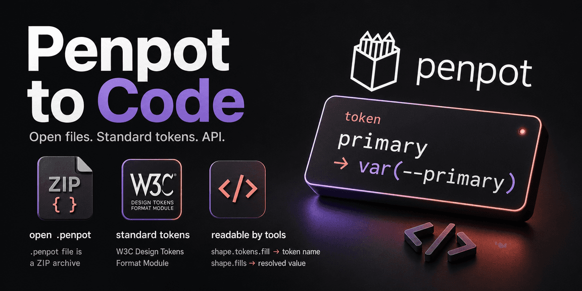
Most design tools treat code as a downstream concern. You design in a proprietary file, hand it off, and hope the engineer reads the spec right. Penpot is built on the opposite assumption. The file format is open, the token model follows a W3C standard so it maps to code variables without a translation layer, and the plugin API lets you read the design programmatically.
I spent a session driving Penpot through its plugin API to consolidate a design system and rebuild a guide board. The rest of this post is what I learned about how Penpot is built for this workflow, and the friction I hit along the way.
The File Format Is Open
Design-to-code starts with the file. If your design lives in a closed binary blob, you are stuck with whatever export the vendor gives you.
A .penpot file is a ZIP archive containing readable JSON metadata alongside binary assets like images. Not a proprietary blob. The v3 format contains a manifest, file metadata, pages, shapes, library assets, storage objects, plugin data, and embedded images.
The history is worth knowing. The v1 .penpot format was a custom binary blob. Penpot also offered a separate .zip export that was SVG and JSON, open but inefficient. The current v3 .penpot format is the best of both: a ZIP container with JSON metadata that is both inspectable and efficient. Your design data is yours, in formats you can read.
That is the foundation everything else builds on. You can get your data out without permission.
Tokens Are the Contract
Tokens are the bridge between design and code. A token in Penpot is a named value: a color, a typography style, a border radius, a spacing amount. When you apply a token to a shape, the shape remembers both the value and the binding.
When you read a shape through the plugin API, you get both:
shape.tokens.fill    // "canvas"
shape.fills          // [{ fillColor: "#000000", fillOpacity: 1 }]
shape.tokens.fill is the token name, as a string. shape.fills is the resolved visual value. The binding and the value, side by side.
That is the contract. If the Penpot token primary maps to the CSS variable --primary, then a shape with tokens.fill === "primary" maps directly to background: var(--primary). The token name in the design file becomes the token name in the codebase. No translation layer, no guessing which hex value maps to which role.
This works because Penpot's tokens follow the W3C Design Tokens Format Module. Penpot is the first design tool to natively integrate this standard, built in collaboration with Tokens Studio. The token names are not Penpot-specific. They are in a format any tool that supports the standard can read.
Tokens Live in Sets
The API shape reflects the model. TokenCatalog does not let you add tokens directly. It only exposes set operations:
interface TokenCatalog {
  addSet(...)
  getSetById(...)
  sets
  themes
}

interface TokenSet {
  tokens: Token[]
  addToken({ type, name, value }): Token
}
Tokens are created on a TokenSet, not on the catalog. The docs put it plainly: "Tokens are contained in sets." There is no free-floating token.
One gotcha worth knowing: Penpot reads dots in token names as paths. I put folder prefixes inside token names, like colors.primary, and got an extra colors folder under the Colors token type. Flat names fixed it.
Themes Are How Light and Dark Work
Coming from Figma, you would expect light and dark to be modes on a collection. Penpot splits it differently. Light and dark are themes, and a theme is a combination of sets.
You put your base tokens in one set: brand colors, spacing, radii. You put light-specific colors in a Light set and dark-specific colors in a Dark set. Then you combine them into themes. The Light theme enables the Base and Light sets. The Dark theme enables the Base and Dark sets. Switch the theme and the whole board swaps.
The API reflects this. TokenCatalog exposes both sets and themes as siblings. You build sets, then you configure which sets each theme activates. The themes property was right there in the snippet above, and I skipped past it the first time through.
How This Compares to Figma
If you are coming from Figma, the mapping is: Figma collections correspond to Penpot sets, and Figma modes correspond to Penpot themes. A Figma collection holds related variables, and a mode stores parallel values for different contexts. In Penpot, a set holds related tokens, and a theme combines sets for a context.
The difference is the format. Figma's variables use a proprietary format. Getting tokens out of Figma in the W3C standard format requires a plugin like Tokens Studio. Penpot exports the W3C format natively. Both implement the same concept. One speaks the standard, one speaks its own dialect.
Name Collisions Are Per Set, Not Per Type
I wanted one Base set with everything: colors, typography, radii, spacing. The natural naming for radii and spacing was xs, sm, md, lg, xl.
Penpot rejected it:
A token already exists at the path: xs or at a prefix thereof.The uniqueness rule is per set, across all types, not per type. So xs cannot be both a borderRadius token and a spacing token inside the same set.
The fix was prefixes: radius-xs, radius-sm, space-xs, space-sm. Colors and typography kept flat names because they do not share names with anything else. The collision only showed up where two scales wanted the same short names. Worth knowing before you design your token naming scheme.
Where Tokens Apply (and Where They Do Not)
Not every token applies to every property. The API enforces this.
I wanted to show each spacing token as a small bar whose length matched the token value, and apply the token to that bar. The API rejected it:
Field message is invalid.I tried marginLeft, paddingLeft, paddingTop. All rejected with the same error. The documented targets for spacing tokens are flex layout properties: rowGap, columnGap, the padding props, and the margin props. In practice, on a board with a flex layout added through addFlexLayout(), only rowGap and columnGap accepted the token. Padding and margin properties kept throwing the validation error.
So spacing tokens are not general-purpose dimensions. They apply to layout gaps. To represent a spacing token visually, I built a small board with a flex layout and set its columnGap to the token. The two rectangles inside the board, separated by that gap, are the visible representation of the spacing value.
Color, typography, and border radius tokens apply cleanly to fills, text, and corners. This matches how you would use them in code: a color goes on a fill, a typography style goes on text, a radius goes on a corner. Spacing goes on the gaps between elements, which in Penpot means flex layout gaps.
Components Map by Spec, Not by Magic
A Penpot component is a design object, not a code file. When I manipulated components through the API, I was changing objects inside the Penpot design file: rectangles, text, groups, library components. Not React, not CSS, not files in the repo.
A Penpot component is a reusable design object with a main instance and copies. Edit the main component and instances update. It has visual properties: fills, strokes, typography, layout, tokens. It does not live in the repository.
To turn a Penpot component into code, you map it by hand. A button-primary design component becomes a React button with CSS that uses the same token names. A Penpot screen becomes an app view. The token names are the bridge. The design object and the code component are related by naming and spec, not by any automatic conversion.
This is the honest version of design-to-code. The tools give you a shared vocabulary (tokens) and an open file format. They do not write your components for you. The mapping is still a person looking at the design and writing the code, but the contract is explicit instead of guessed. A format like DESIGN.md can carry those token names into the repo, so an AI agent or a developer reads the same source the design tool exports.
The API Lets You Inspect Everything
Design-to-code tooling needs to read the design programmatically. The plugin API is built for this.
History has two layers, which gives a sense of how the API is organized. Undo history is the in-session editing timeline. The plugin API can group edits into one undo step with penpot.history.undoBlockBegin() and penpot.history.undoBlockFinish(block). Wrap a batch of edits in a block and one undo reverts the whole thing.
File versions are saved checkpoints. The API exposes penpot.currentFile.saveVersion("label") and penpot.currentFile.findVersions(). A saved version is a point you can return to later, across sessions. I saved the consolidated state as Version 1 through saveVersion. The return value hit a serialization bug in the wrapper, but findVersions() confirmed the version existed with the right label. The save worked even though the return value did not serialize cleanly.
The point is that the design file is queryable. You can walk the shape tree, read tokens and fills, list sets, save versions, and trace what changed. That is what a design-to-code pipeline needs to feed from.
Export and the Practical Reality
Exporting is where I hit the most friction, and the logs are worth reading because they show how the exporter works.
The export tool kept failing. First with http error, then with timeouts after 30 seconds. A 100x100 test board with a red fill timed out too, so the board content was not the problem.
The Penpot exporter logs showed why:
ERR [app.handlers.export-shapes] hint="unexpected error on single export"
page.goto: net::ERR_CONNECTION_REFUSED at http://penpot-frontend/render.html
The exporter is a headless browser that navigates to a render URL and screenshots it. It was trying to reach http://penpot-frontend/render.html and getting connection refused. That is a deployment problem. The exporter container could not resolve or reach the frontend service hostname.
After the fix, the logs changed:
INF [app.renderer.bitmap] uri="https://penpot.example.com/render.html?..."The exporter was now reaching the frontend over the public URL and rendering. The exec:handle:end line showed the browser finished its work. The MCP tool I was calling through still timed out at 30 seconds. The render completed server-side. The wrapper returning the result to me was the bottleneck.
The takeaway: when a Penpot export fails, read the exporter logs. The error names the URL the exporter was trying to reach. ERR_CONNECTION_REFUSED at an internal hostname means the exporter cannot find the frontend. A timeout with no error in the logs usually means the render itself is slow, or the tool wrapper is the limit, not Penpot.
What Penpot Gets Right for Design to Code
Penpot is not magic. You still write the code. What Penpot gives you is a design tool built on assumptions that make design-to-code possible:
- An open file format you can inspect and extract.
- A token model based on the W3C standard, where the binding and the value are both readable, and themes handle light and dark without duplicating files.
- A plugin API that lets tooling walk the design and read the contracts.
- Components that map by naming and spec, with no lock-in on how you implement them.
Read more
Design Tokens, DESIGN.md, and Design to Code
What design tokens actually do (and what they do not), how DESIGN.md became the format AI agents read, and how the design-to-code movement is changing the handoff from design to production code.
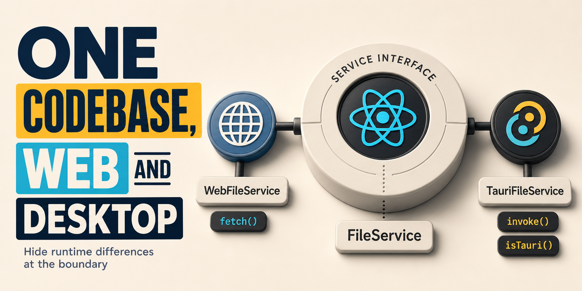
One Codebase, Web and Desktop
How to design a Tauri app so the same React code runs in the browser and on the desktop, by putting the runtime differences behind a service interface.

How Mobile Apps Work
The three ways to build a mobile app, what each one actually runs under the hood, and the shared architecture pattern behind React Native, Flutter, and Tauri mobile.